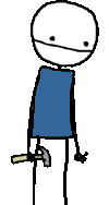
Unfortunately, it looks like sometimes less is less. I'm usually a fan of minimalism, but in some of these comics it looks like you left out the punchline.
The pregnant pause is a useful technique, but don't overuse it. If you've got two identical first panels and then your characters only do something in the third panel, it may be that you really have a one-panel comic. Toss three of them together, or use the "black" background to eliminate two of the panels.
Highlights, for me:
| |
|
|
|
|
|
|
|
|
|
 | |  |
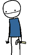
| Are you tryng to avoid me? | |
 | |  |
|

 |
|
|
|
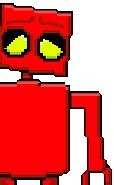
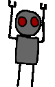
Here we've actually got some action across the panels. Red Robot enters the scene, and uses his facial expressions. That's what makes the comic work. The absurd idea that the guy would put cement on his feet and jump into the river to avoid someone is funny, but wouldn't work without the action to set it up.
| |
|
|
|
|
|
|
| | |
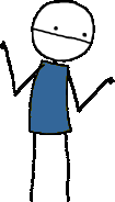
| I've done it! I have destroyed the world! | |
| | |
|
 |
|
|
|
|
|
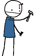
Probably not overwhelmingly original, but amusing nonetheless. Effective use of the pregnant pause.
Not really exciting, but I just wanted to point out that this is one place where the two identical silent first panels actually works well.
All in all, I felt a lot of your comics fell short, but weren't brain-stabbingly awful like some people's. Work on them a little more, maybe try to study whatever you find funny about other people's stuff, and I think you'll be well on your way.
Welcome to Stripcreator.
---
The what mentioned above is total fiction. Please don't take it seriously!